Droogfruit
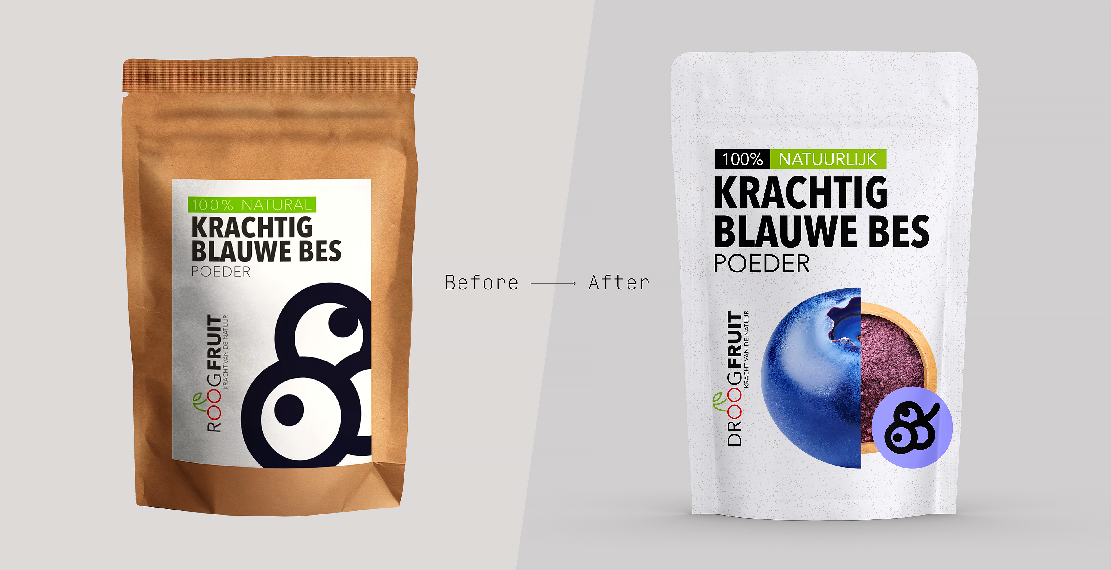
Packaging redesign for premium freeze-dried fruit and vegetable powders.
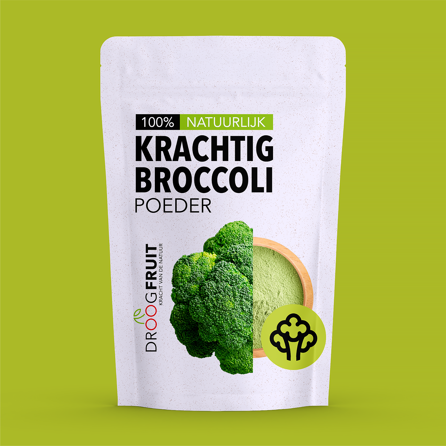
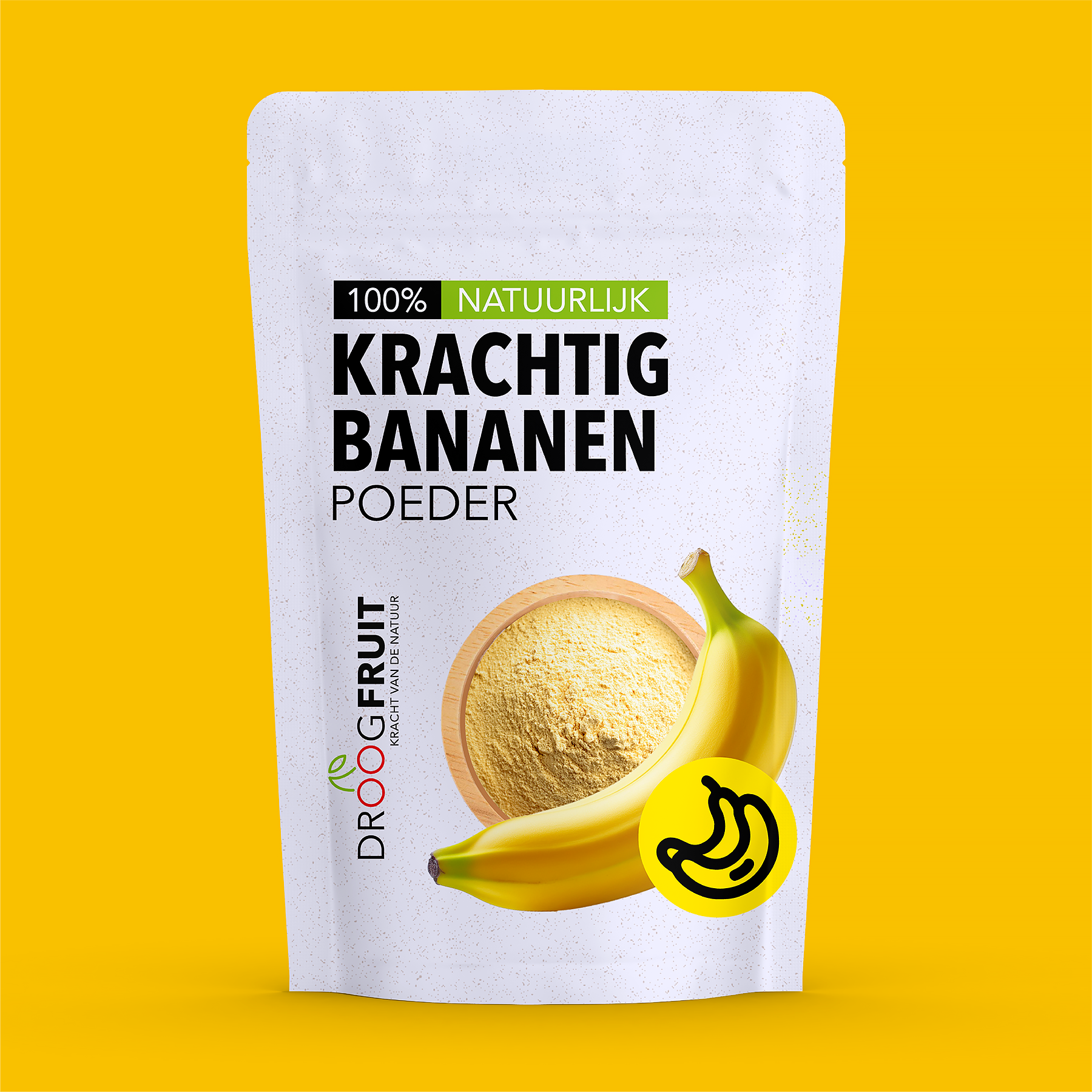
The redesigned identity transforms the brand from simple kraft paper labels into a refined, direct-printed white packaging system. While preserving the original typography and layout hierarchy, the new design enhances shelf appeal through vibrant split-shot imagery that pairs fresh ingredients with their powdered counterparts.
A clean, minimalist backdrop accented by natural colors reinforces the products' 100% purity, avoiding the clinical aesthetics often associated with fitness and health supplements. The resulting packaging system is fresh, versatile, and easy to navigate, appealing equally to everyday consumers and professional chefs.